Visualizing the Results
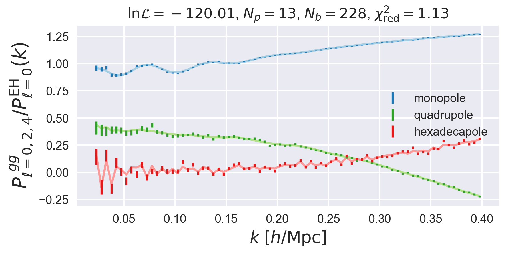
Comparing the Best-fit Model to Data
The best-fitting theory can be compared to the data visually by loading the
results of a fitting run using the pyRSD.rsdfit.FittingDriver
and using the FittingDriver.plot function. This function
will plot the data and best-fitting power spectra, properly
normalized by a linear power spectrum. For example,
from pyRSD.rsdfit import FittingDriver

# load the model and results into one object
d = FittingDriver.from_directory('pyRSD-example', model_file='pyRSD-example/model.npy', results_file='pyRSD-example/nlopt_result.npz')

# set the fit results
d.set_fit_results()

# make a plot of the data vs the theory
d.plot()
show()
Visualizng MCMC Chains
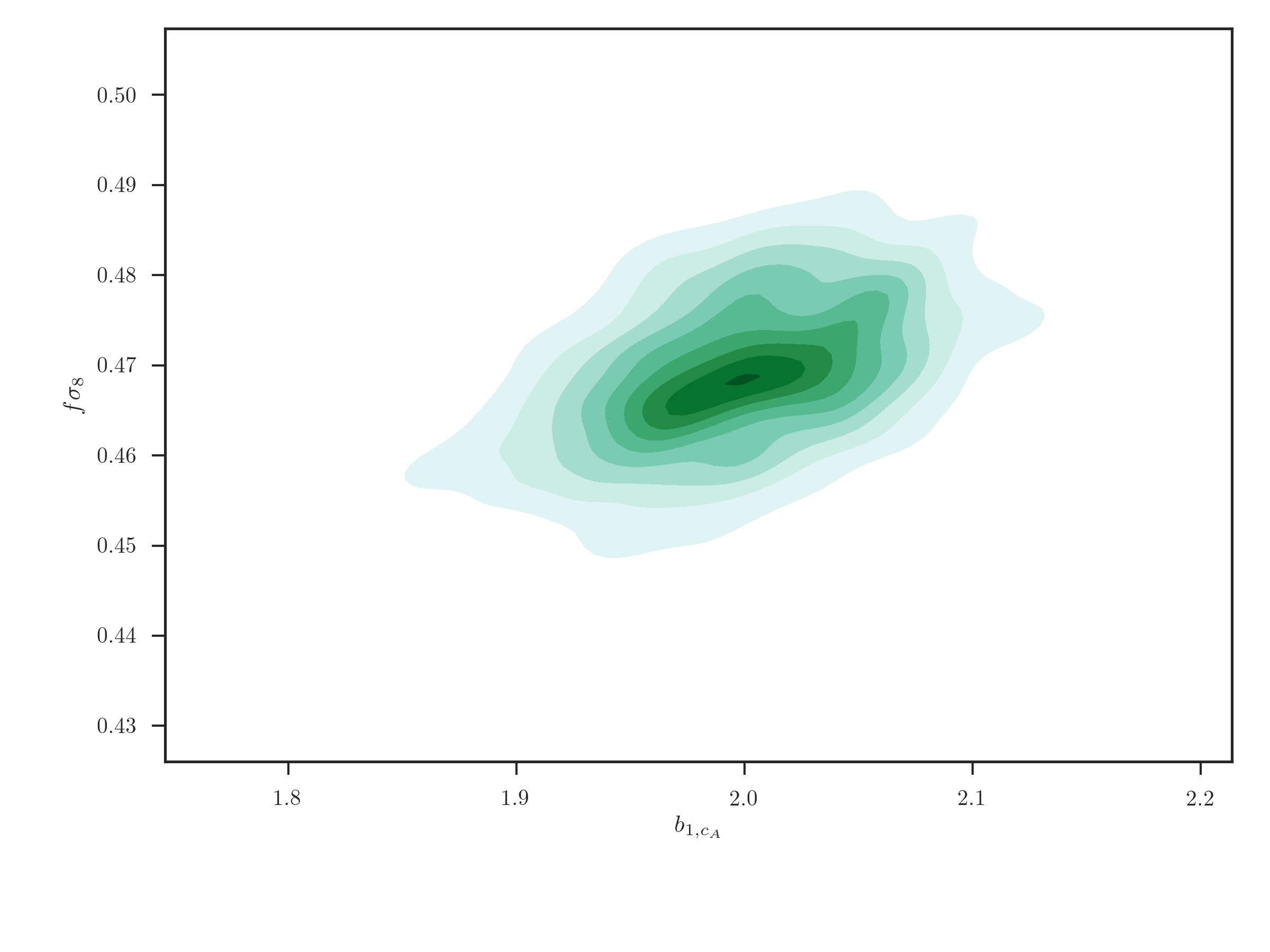
The user can plot 2D correlations between parameters using the
EmceeResults.kdeplot_2d() function, which uses the seaborn.kdeplot()
function,
from pyRSD.rsdfit.results import EmceeResults
r = EmceeResults.from_npz('mcmc_result.npz')

# 2D kernel density plot
r.kdeplot_2d('b1_cA', 'fsigma8', thin=10)
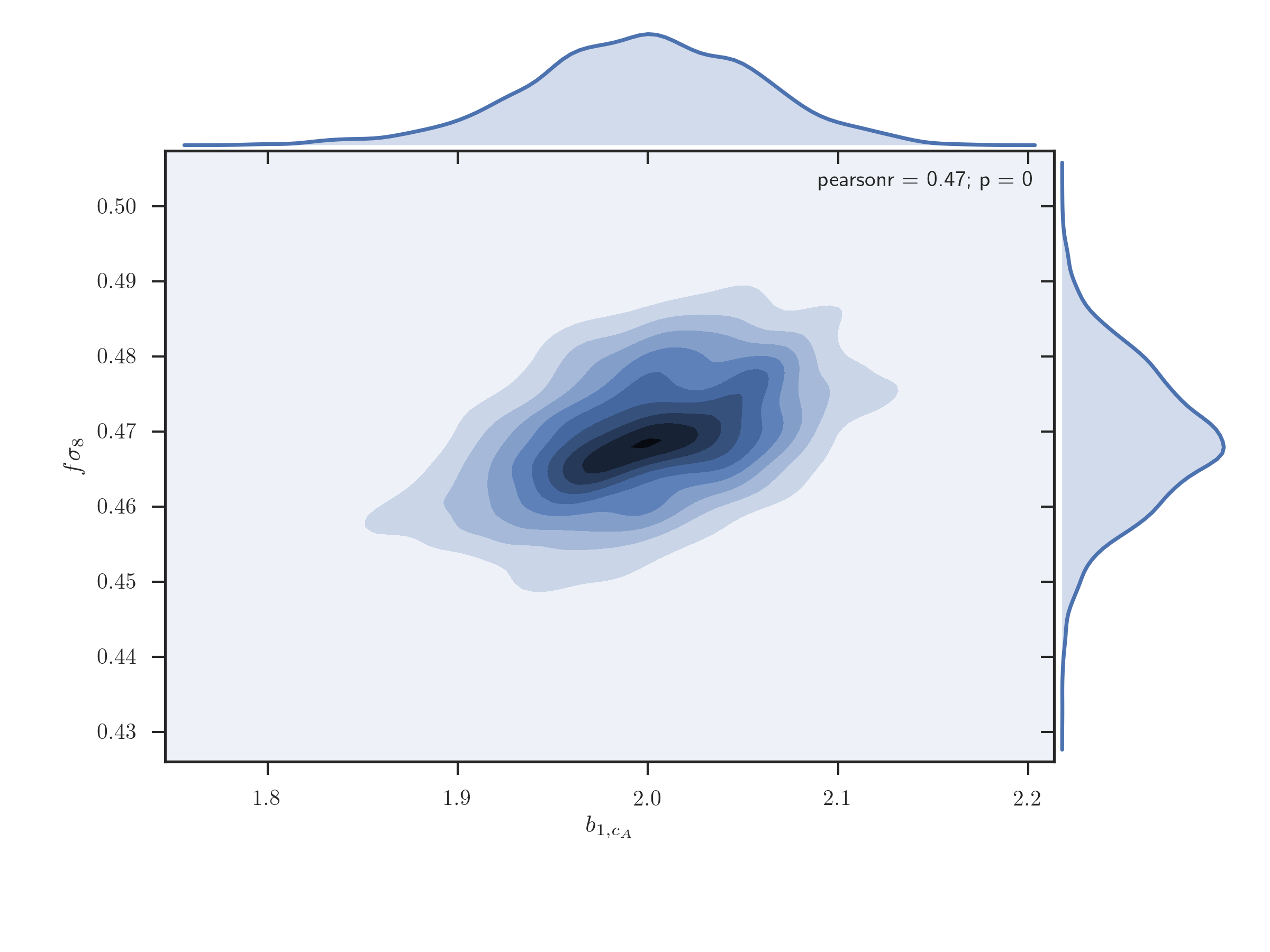
A joint 2D plot of the MCMC chains with 1D histograms can be plotted using the
EmceeResults.jointplot_2d(), which uses the seaborn.jointplot()
function
# 2D joint plot
r.jointplot_2d('b1_cA', 'fsigma8', thin=10)
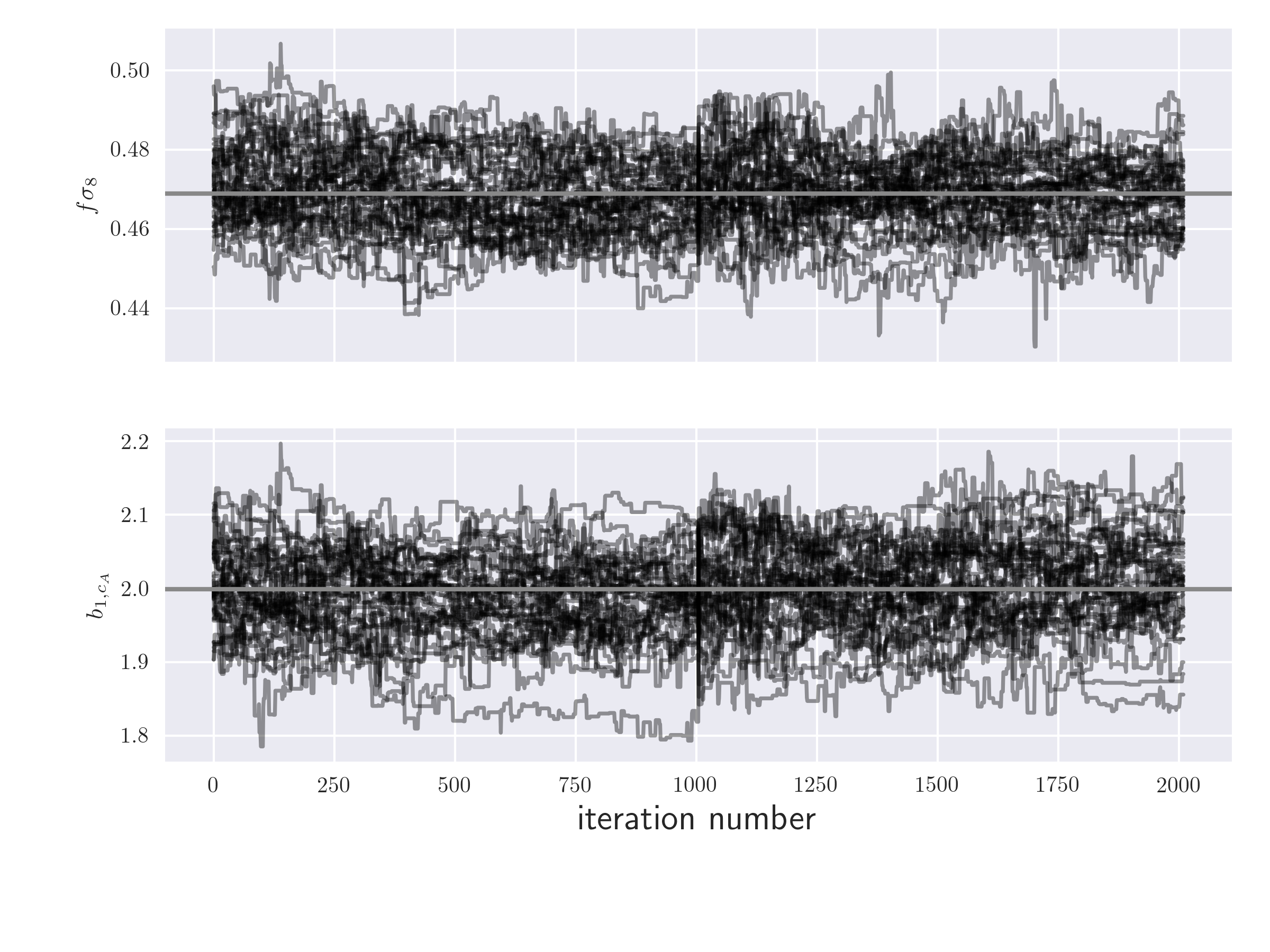
In order to investigate whether the chains have converged, the user can
plot the timeline of the MCMC chain for a given parameter using
the EmceeResults.plot_timeline() function
# timeline plot
r.plot_timeline('fsigma8', 'b1_cA', thin=10)
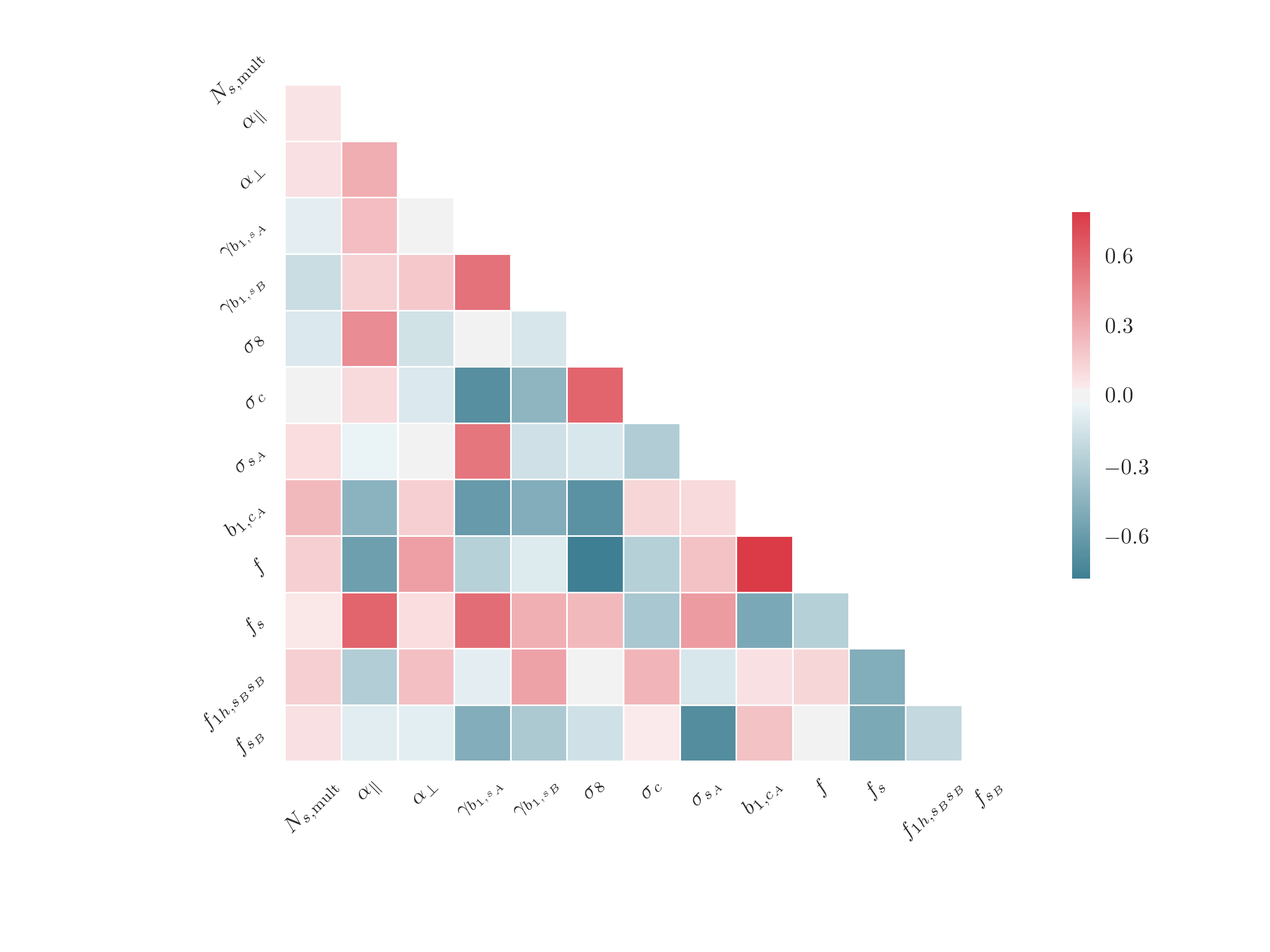
The correlation matrix between parameters can be plotted using the
EmceeResults.plot_correlation() function, which uses the
seaborn.heatmap() function
# correlation between free parameters
r.plot_correlation(params='free')
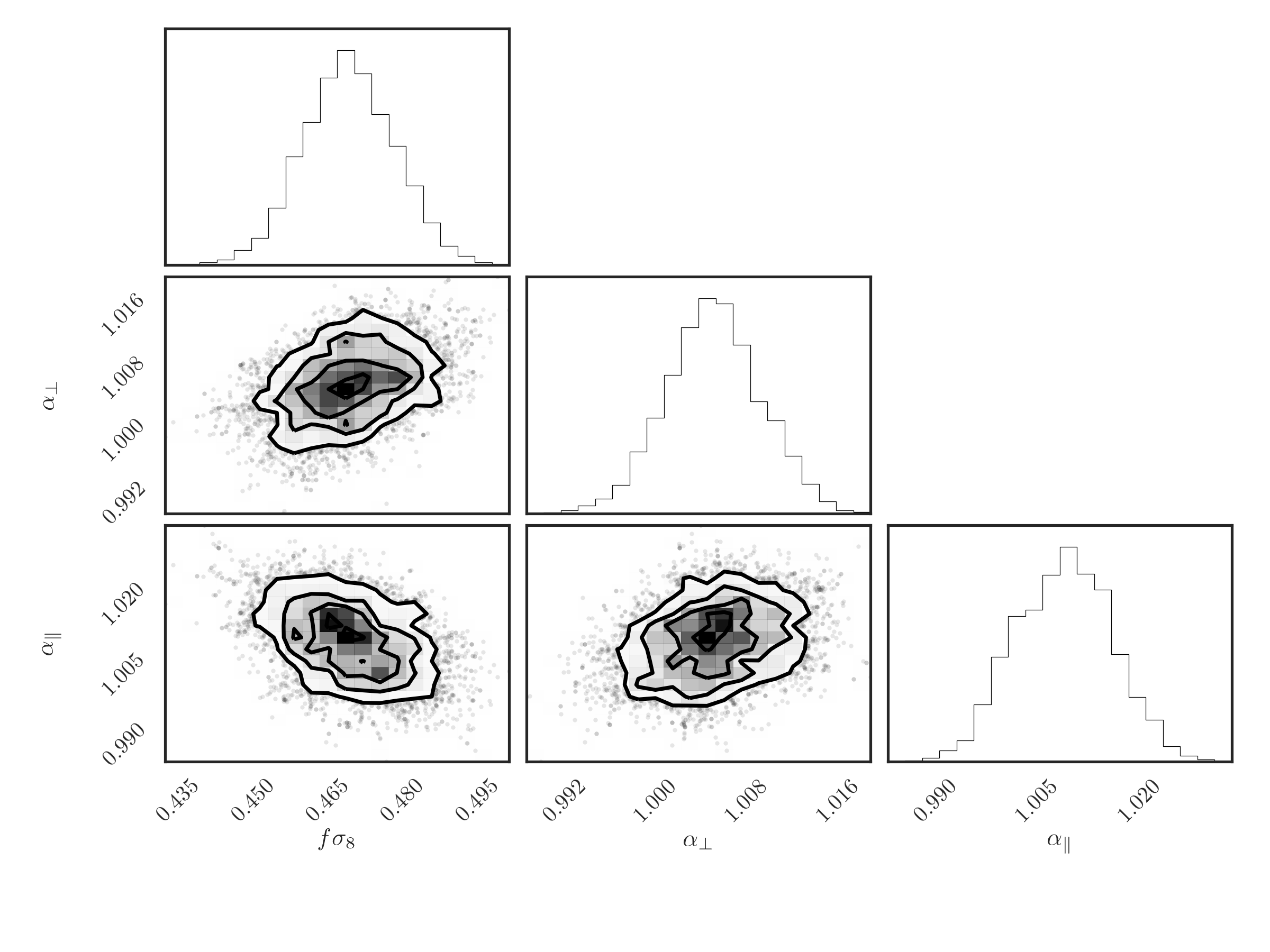
And, finally, a triangle plot of 2D and 1D histograms for the desired
parameters can be produced using the EmceeResults.plot_triangle(),
which relies on the corner.corner() function
# make a triangle plot
r.plot_triangle('fsigma8', 'alpha_perp', 'alpha_par', thin=10)